Designer and Comic Illustrator (and music lover!)
Oops…a tad late this week…but hey look on the bright side, it just means you have less time to wait for the next page! (hopefully the next page will be done by Thursday)
My graphic design portfolio review was last week so that’s where all my time ran off to…
Anyways, as for commentary on the page itself, we finally got to the mysterious stranger’s name! 😀 Hey remember when I mentioned that “Joel and Janice were the first two characters I designed”? Well here he is. While Janice didn’t change extensively, Joel changed a lot as a character. His actual design may have hardly changed since the initial sketch, but his role in the story changed tremendously. Looking at my numerous scribbles and notes in my sketchbook, I’m pretty sure he’s the character that I tried to put the most thought into.
Sometimes when someone is being annoyingly melodramatic in a film/book/comic you just want to bonk ‘em on the head and tell them to “get over yourself.” See Joel for example…
Warning! BLOOD!!! O.O
Yup, stuff…
Maybe I should practice drawing blood. I’ve never drawn it before, so it was really weird. Also drawing the casted shadows of the guards was really strange to figure out.
By the way, I am really fond of this panel layout……
AGH! It’s done!!
It’s been a long week and after several extra hours this week’s page is done. Just over the course of this week, this page was rewritten at least thrice before landing on this version. I had a hard time deciding on what was actually gonna happen on this page.
I also had an unusually difficult time coming up with appropriate dialogue for this page, but I’m mostly content with the finished script. Just for those of you who actually read my comments, in the middle 4 panels there was actually a fourth word bubble right between the third and fourth panel (the only panels that do not have a word bubble anymore). It was one of the guards merely saying “Well first let’s find a new lantern.” Yeah. Kinda lame. That’s mostly why it was cut, that and I wanted a “silent” panel without a word bubble before the monk pops his head out the door. It wasn’t cut till halfway through inking the page, so it really was a last second decision to leave out.
Also after two pages using a really odd layout we’re back to a more static, normal layout. Well…kinda at least. I always strive to make each page unique or new in some way. For this page I was really interested in how the four middle, tall panels extend behind the other panels.
Yay! More action!!
Well, that new character didn’t last long. And we didn’t even get to know his name…
This page was really hard to layout since it was so radically different than most of my normal layouts. I really like how the action ends up flowing between each panel and how dynamic it feels though.
I always thought this was how a “daring escape” would honestly go in real life. You would do something really cool at first, everything would be going awesome, then you make like this epic heroic leap……and fall flat on your face…
P.S. I’ve been kinda waiting to use the sound effect “POW” for awhile now X3
Apologies for the late updates recently…
This page took a little more time than first anticipated. Can you guess why? >.<
I really love trying out new ideas with different pages, and this is a layout concept that had been floating around in my brain for a while now. Taking one giant image and placing all the panels on top of it, rather than my traditional white, negative space. Setting aside the huge amount of extra work this requires, I think it's a cool idea. Personally I think it would work better if the other panels had simpler backgrounds or nothing at all like the top four panels shown here.
Also some of the shading got a little loose towards the end of this page since I was so tired, but I hope it's still decent enough.
Well, next page.
A day late I know, but the shading still needed some extra work yesterday so I delayed the page a day.
And Chapter 4 is off! and what a start!!
Seriously though, this page took much longer than several of my other pages. Lots of pen work. Lots of shading.
The element that actually took the longest is actually the architecture. I really like studying architecture, but I was never amazing at designing it. In MitM I don’t tend to use references in an attempt to stay more original, but it also means I have to get a little more creative and design everything I draw. When it comes to building and architecture I found out pretty quick that my creative skills are fairly lacking there.
“I wanna draw a house!” “Cool.” ” What should it have?” “……windows?”
Anyways I decided to put some extra practice time in to try to land some more profound architecture models. Hope it paid off ^^

Chapter 4 here we come!
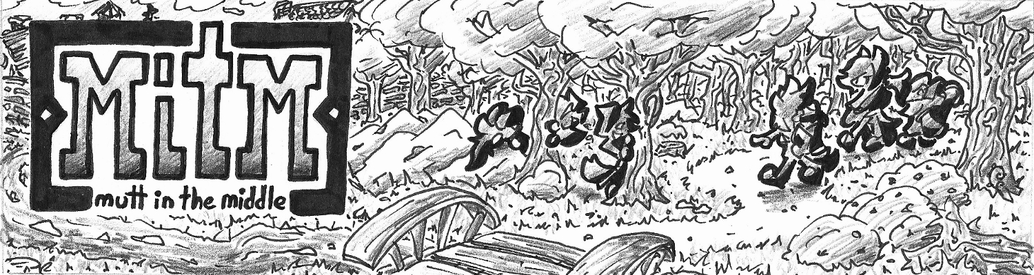
New Character! New way of drawing the Chapter title pages!! New title/logo!!!
I’ve been wanting to redesign the logo for MitM for some time now and I was really excited to show off the new design. This is going to be an important chapter and I wanted to start it off strong 😀
The End…
What a great story.
But seriously, Chapter 3 was a lot of fun and I enjoyed it. Chapter 4 is just around the bend now! I’ve been trying to decide if i want to take a break to think about the next chapter before diving right in, but I think I already have a good enough of an idea of where I want to go with it.
So that said, hopefully you’ll see the beginning of Chapter 4 next Thursday! 😀
Fun fact: This was the final page I posted to MitM’s spot on ComicFury. Overall, ComicFury was a decent site, and definitely a decent place to go to begin a webcomic, but I wanted to make an official website that wasn’t just anoter subdomain under some other site.

Decided to do this special in the same “poster format” as this year’s Christmas.
2016. Wow. This is going to be a big year for me, with graduating from college this coming spring kinda peaking this insurmountable mountain of a year.
Have a Happy New Year everyone!!