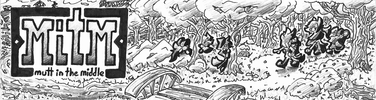
Phew. I did it. I wrapped up Sam and Janice’s talk in only three pages. O.O
Sigh…I just had to goof up Sam’s expression in the fourth panel though. No amount of post-editing could save it…
These last two pages have been drawn slightly different, from a process point of view at least. Normally I draw the boxes/panels, illustrate them, and then place text balloons over the drawings. These last two pages though I’ve drawn the word bubbles right after the paneling to help better place the illustrations and not have to worry about cramming the words in a more restricted space.
Not a particularly exciting “page commentary” today, but didn’t really have much to say about it, so I filled this time with boring behind-the-scenes info 😛
Days of Future Passed (1967), The Moody Blues with The London Festival Orchestra conducted by Peter Knight. An album not to confused with the popular X-Men story Days of Future Past. A fascinating bridge between pop and classical, this album really challenged the notion of what popular music could be and almost completely began a new genre all by itself. Progressive rock, the playground of talented bands like Yes, Rush, Pink Floyd, and many others.
One of the funny things about Days of Future Passed is that even though it was based around the notion of bringing an orchestra and a rock band together, all the material was recorded separately (all except one song…). All of the songs by The Moody Blues were done in a recording studio and the orchestra, lead and composed by Knight, was recorded elsewhere. Even the album keeps the two separate with songs by the band being featured and interludes between the songs by the orchestra. However the last song “Nights in White Satin” is the only one to feature both playing together, and even then they were still recorded separately.
It’s interesting that the band that would finally come up with this popular notion of mixing classical and rock/pop was The Moody Blues. A band that two years earlier had released their less than successful R&B debut album and a slightly successful single “Go Now.” While the Beatles had used an orchestra earlier the same year for “A Day In the Life” (the ending track for Sgt. Peppers), the idea was still extremely new to the industry. Mike Pinder’s heavy use of the Mellotron on this album also had a significant impact upon what would become the Progressive rock industry as well as the then blooming Psychedelic genre.
I tried really hard on this LP choice to go with something other than just another “first and last song on album” (which if you haven’t noticed yet, is a fairly common choice on my Monday LPs…), but both of these songs complemented one another so well. From the melody of “Nights in White Satin” being teased by the orchestra in “The Day Begins” to the first and second half of the poem (spoken by Pinder) being split between the two songs. While the lyrics of “Nights in White Satin” may border on the cliche of their pop influence, the song’s (and album’s) unique sound and psychedelic imagery definitely paved the way for a new world of music.
Maybe it’s just me, but this page seemed like it had a lot of dialogue while I was drawing it. Part of this page’s lengthy dialogue is me still trying to test out my conversation skills between characters and trying to capture the odd quirks that occur in a casual exchange of words. Also I was surprised by how much I wanted to get said between Janice and Sam in this scene…
Fun side story, Charlie was the original name I had chosen for…uh…we’ll call him Coy for ease. Anyways during the preparation for this comic Coy’s name changed a ridiculous amount of times. Eventually I came up with this stupid idea to weave it into his character. 😛
Also since I’m in Pacific time, I’m just barely getting this update online on Thursday. Success!!
Weaving Through Design History: International Typographic Style (a.k.a. Swiss Style)
Originally a style that was pioneered by Bauhaus and drawing inspiration from Russian Constructivism, the International Typographic Style wouldn’t be fully realized until the 50s by designers in Switzerland. What was commonly called the “Swiss Style” stressed a simple, clean approach to typography that would make heavy use of a grid layout that was normally asymmetrical. This style would largely focus on the typography as the primary focus of the design and really pushed the use of photography in the design industry (rather than illustrations). Also overlapping colors were common of the style.
While I’m not completely sure I stayed true to some of the style’s theories, I’m pleased with the outcome. I’d really like to try this style again with maybe only a single color scheme. That and incorporate some more asymmetry into the design (and left aligned text rather than centered).
This Weaver poster also marks the last one from my stockpile of already done posters, so don’t expect to see two more Weaver posters next week 😛
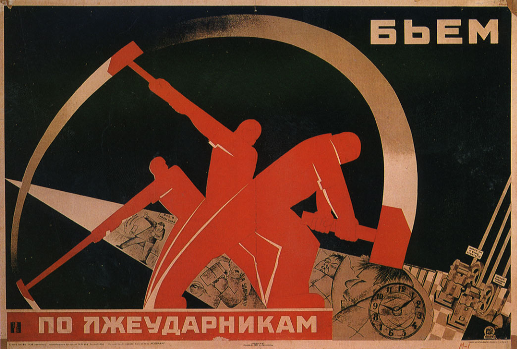
Altogether now comrades!! Ah, it was fun to do another design history poster. This time: Constructivism, a very (and I mean very) influential Russian design era.
Constructivism was a movement started in 1913 that encompassed several fields like architecture, fashion, dance, film, and especially industrial design. Posters were characterized by very bold, dynamic use of font and often simple color schemes (normally revolving around red though. After all, we are talking about Mother Russia) x3
Also due to its place in history, communism was still a new, and very different, form of government for Russia. Posters were designed to help communicate to the public the ideals behind the U.S.S.R. While some could easily be lumped in as propaganda posters, several were more nationalistic or informational in nature. Most posters often depict workers, sometimes individuals or even large masses of workers.
If it reminds you of the Bauhaus poster I already did, you would be correct. Most of the influential Russian designers from the Constructivist movement taught several classes there, further refining (and eventually altering) the style. De Stijl was also heavily inspired from this movement.
Most of the WTDH posters I have done only pull inspiration from an era. This one on the other hand was much more directly inspired from this poster: Poster.
Don’t get me wrong, there are some awesome posters from this movement, but I was terribly fond of this one known only as “Fighting Lazy Workers,” artist unknown. It exemplifies the simplicity of the era’s lines and shapes (much better than mine at least).
We continue to wildly swing back and forth between light and heavy musical genres this week.
…OR DO WE??? :3
Bat Out of Hell (1977), by Meatloaf (songs by Jim Steinman). Alright unless you are aware of Meatloaf’s musical career, you probably have some preconceived ideas of what this album will sound like. However, don’t let this record deceive you by its looks and name. I was personally surprised by this album when I first heard it, and I would honestly admit that it’s now one of my favorite vinyls in my collection :O
While Bat Out of Hell is definitely a “hard rock” album, “metal” would probably be a poor overall description of Meatloaf’s sound. “Wagnerian Rock” is what Steinman personally coined to describe the album and the term has come to define other bands (like more recently the German industrial band Rammstein). While you can easily find a better definition than one by me, I’ll briefly state that music from this genre draws heavy inspiration from the man its named after, the German opera composer Richard Wagner (you know…”Flight of the Valkyries” guy…)
As for the album itself, it is certified platinum 14 times with over 40 million sales, making it one of the top ten best selling albums of all time! O.O
Quick shout out to the comic artist Richard Corben who illustrated the album cover (you know since this is a webcomic blog after all…). You might know him from his time with Heavy Metal magazine or his work on the Hellboy comics for awhile.
Michael Lee Aday, better known by his stage name “Meatloaf,” had actually released one album prior to Bat Out of Hell, but it was within the soul genre. This album would mark his rock debut, which would define the music for the rest of his career (kinda like how the Moody Blues second album was radically different than their first, but that’s another story for…next week??). Like last week’s Dean Martin, Meatloaf is also a multi-talented individual acting in several movies and plays. One of his more memorable movie roles was as Robert Paulson from Fight Club.
A relatively short album in terms of songs (only 7 tracks), but still over 45 minutes in length. Due to the longer nature of the songs, I figured the most reasonable thing to do was pick the longest two songs. 😛 But seriously, I had to choose the opening title track “Bat Out of Hell,” which boasts a wide range of musical technique from the whole band. This song follows a reckless young man as he meets his fate after a terrible motorcycle crash. I then chose maybe my favorite song on here, the album’s closing song, “For Crying Out Loud.” This one is a love song about the singer’s lover and her positive impact upon his life even though he’s reached the bottom of life. While these songs are fairly serious in nature, I hope it doesn’t underplay the humor and wit found throughout the album and featured more prominently on some of the other songs.
Also really random tidbit, but I found out that my copy of this record (which is sadly in pretty rough shape) is actually the Canadian version. It’s hard to see it in the picture, but centered at the bottom of the cover it says “Songs by Jim Steinman.” Steinman’s name is normally shown directly below the title “Bat Out of Hell” on the original US version though.
Ugh. I think I tried to say too much with this page…
I worked on several different scripts for how the dialogue would proceed on this page, and I had issues with each version. While I’m mostly content with this one, I still wish I left out the last line on this page. I feel like I should have just ended it with, “Uh, yeah…”
On a more positive note, I’m feeling more confident in my inking. Also if you honestly thought the inside of the carpentry would look just like it did 4 years ago on Page 1, you would be sorely mistaken 😛 My backgrounds have come a long way…
Okay. So officially the most complex poster I’ve done so far. Took me somewhere around 20 hrs probably. Apart from the time consuming process of individually adding textures to each “glass panel”, the actual Blacklettering took me a few hours since I drew it with a marker on paper.
Gothic art and architecture was a style that originated in the 12th century out of Romanesque art, so definitely a jump back in time compared to all my previous modern designs. It would change and evolve over the centuries until it was almost completely replaced by Renaissance art in the 15th century. Although Gothic art was a significant influence to the Art Nouveau movement (mostly for its architecture though).
During Medieval times in Europe, light was considered very sacred, even divine. With the architecture advances that came during the Gothic era walls could be made much taller, thinner, and lighter (due largely to flying buttresses, which are really cool!). This allowed for most walls to be replaced by glass, more often than not, stained glass.
So I have always started all of my WTDH’s with an ink drawing. When I tried doing something Bauhaus-like, I realized halfway through it wasn’t working and gave up and went my own way. This was the result of that experiment.
I’m not exactly sure what to consider it…
It’s definitely still abstract and modern, but it almost has a late 70s or early 80s Atari vibe (to me at least, especially in the lettering). I did end up using this drawing to base my Bauhaus poster on if you were noticing the similar shapes.
Somewhere There’s a Someone (1966), by Dean Martin. With a mere jump back of fifty years we have arrived at a much different sound than My Chemical Romance 😛
Dean Martin was an entertainer. There really is no other way to put it. You can’t just mention him as a singer or you’ll be leaving out his long acting career on both television and the silver screen. If you label him an actor, you’ll be underplaying his impact as a slapstick vaudevillian comedian with his (extremely funny) partner Jerry Lewis. Listing him as a comedian wouldn’t take serious his musical talent as a distinguished crooner that mixed in some country elements. On top of all this he would even shockingly derail a Beatles song from the Number 1 spot on the US billboards during the height of rock and roll popularity and the decline of crooner music (often called Easy Listening or Adult Contemporary).
The album I chose is a little bit of an oddity itself. Released in 1966, Somewhere There’s a Someone was made while The Dean Martin Show was airing, which meant Martin didn’t have any time to actually record an album. Thus this album was created, consisting of both sides of the single “Somewhere There’s a Someone” and some songs pulled from two of Dean’s “country themed” albums. Although technically it is considered a studio album, not a compilation album (I literally have no have no idea why…). It was the first of five albums to be released that year and probably Martin’s best selling album right behind his Christmas album (which was one of the other albums released in ’66).
These two songs give a good example of the two different sounds of Martin’s music. “Somewhere There’s a Someone” tackles a common crooner theme: love (big surprise there). This genre of music may tend to be predictable and really middle-of-the-road, but those also end up being the major selling points of Easy Listening. The other song, “Walk the Line,” is an excellent song written by Johnny Cash. While I still prefer Cash’s version hands down, this track demonstrates how Martin was able to lend his Italian-crooner voice to the country sound.
With seven different Dean Martin albums in my collection, I knew I had to pay him some attention soon. While I have a few other crooners in my collection like Andy Williams and Frank Sinatra, Dino is by far my favorite amongst the bunch. Sometimes it’s nice to just sit back and listen to something nice and easy. Also, Whoops! Sorry about that harsh needle drop at the beginning of the first track ^^;


