Skip to content

Some random side posters done in varying graphic design styles revolving around the character Grill Weaver.
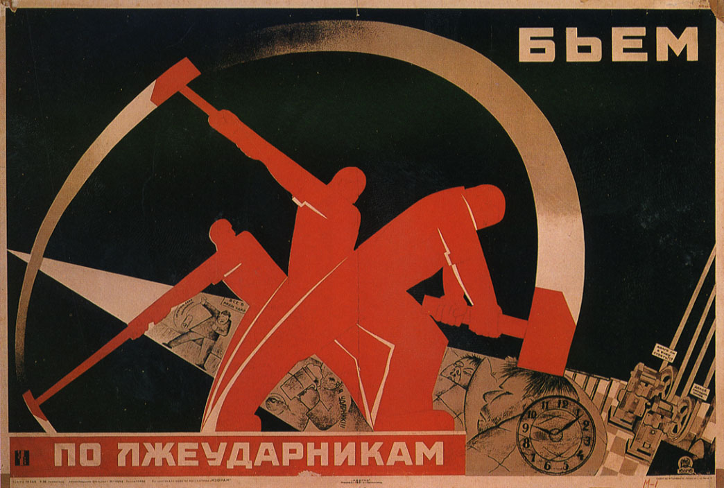
Weaver Swiss

Weaver Swiss published on No Comments on Weaver Swiss

Weaving Through Design History: International Typographic Style (a.k.a. Swiss Style)

Originally a style that was pioneered by Bauhaus and drawing inspiration from Russian Constructivism, the International Typographic Style wouldn’t be fully realized until the 50s by designers in Switzerland. What was commonly called the “Swiss Style” stressed a simple, clean approach to typography that would make heavy use of a grid layout that was normally asymmetrical. This style would largely focus on the typography as the primary focus of the design and really pushed the use of photography in the design industry (rather than illustrations). Also overlapping colors were common of the style.

While I’m not completely sure I stayed true to some of the style’s theories, I’m pleased with the outcome. I’d really like to try this style again with maybe only a single color scheme. That and incorporate some more asymmetry into the design (and left aligned text rather than centered).

This Weaver poster also marks the last one from my stockpile of already done posters, so don’t expect to see two more Weaver posters next week 😛

Weaver Constructivism

Weaver Constructivism published on No Comments on Weaver Constructivism

Weaving Through Design History: Constructivism

Altogether now comrades!! Ah, it was fun to do another design history poster. This time: Constructivism, a very (and I mean very) influential Russian design era.

Constructivism was a movement started in 1913 that encompassed several fields like architecture, fashion, dance, film, and especially industrial design. Posters were characterized by very bold, dynamic use of font and often simple color schemes (normally revolving around red though. After all, we are talking about Mother Russia) x3

Also due to its place in history, communism was still a new, and very different, form of government for Russia. Posters were designed to help communicate to the public the ideals behind the U.S.S.R. While some could easily be lumped in as propaganda posters, several were more nationalistic or informational in nature. Most posters often depict workers, sometimes individuals or even large masses of workers.

If it reminds you of the Bauhaus poster I already did, you would be correct. Most of the influential Russian designers from the Constructivist movement taught several classes there, further refining (and eventually altering) the style. De Stijl was also heavily inspired from this movement.

Most of the WTDH posters I have done only pull inspiration from an era. This one on the other hand was much more directly inspired from this poster: Poster.
Don’t get me wrong, there are some awesome posters from this movement, but I was terribly fond of this one known only as “Fighting Lazy Workers,” artist unknown. It exemplifies the simplicity of the era’s lines and shapes (much better than mine at least).

Weaver Gothic

Weaver Gothic published on No Comments on Weaver Gothic

Weaving Through Design History: Gothic

Okay. So officially the most complex poster I’ve done so far. Took me somewhere around 20 hrs probably. Apart from the time consuming process of individually adding textures to each “glass panel”, the actual Blacklettering took me a few hours since I drew it with a marker on paper.

Gothic art and architecture was a style that originated in the 12th century out of Romanesque art, so definitely a jump back in time compared to all my previous modern designs. It would change and evolve over the centuries until it was almost completely replaced by Renaissance art in the 15th century. Although Gothic art was a significant influence to the Art Nouveau movement (mostly for its architecture though).

During Medieval times in Europe, light was considered very sacred, even divine. With the architecture advances that came during the Gothic era walls could be made much taller, thinner, and lighter (due largely to flying buttresses, which are really cool!). This allowed for most walls to be replaced by glass, more often than not, stained glass.

Weaver Retro Arcade(?)

Weaver Retro Arcade(?) published on No Comments on Weaver Retro Arcade(?)

Weaving Through Design History: Retro??

So I have always started all of my WTDH’s with an ink drawing. When I tried doing something Bauhaus-like, I realized halfway through it wasn’t working and gave up and went my own way. This was the result of that experiment.

I’m not exactly sure what to consider it…

It’s definitely still abstract and modern, but it almost has a late 70s or early 80s Atari vibe (to me at least, especially in the lettering). I did end up using this drawing to base my Bauhaus poster on if you were noticing the similar shapes.

Weaver Bauhaus

Weaver Bauhaus published on No Comments on Weaver Bauhaus

Weaving Through Design History: Bauhaus

Bauhaus was an art school located in Germany open from 1919 till 1933. If the Great Exhibition of 1851 is considered the BC to AD moment in Graphic Design history, the Bauhaus could be remembered as the moment design dove head first into the modern era. Not only was modern design rooted heavily in this school, but industrial design and minimalism became a focus as well.

Even though it was closed by the Nazi party in 1933 (due to the belief that it was teaching and encouraging communistic thought), its fleeing artists would spread their ideals across the world in the following years.

Weaver Victorian

Weaver Victorian published on No Comments on Weaver Victorian

Weaving Through Design History: Victorian

Another poster with two versions. I really wanted to do one in only black and red to more closely mimic circus posters of the time that were only printed in those colors. I’m honestly torn on which version I prefer, so I provide you both of them for your viewing pleasure x3

HA! Spent like forever on this poster.

I didn’t have any experience, and much less knowledge, about the Victorian Era, so I had to look at a lot of examples and practice some patterns. While I did ink all of this with a marker, I decided to call it good with filling in only part of the border decoration with color. The ones that aren’t colored weren’t live-traced properly in Illustrator to just apply a color to the shape. And well I was feeling lazy… 😛

The Victorian Era is the easiest era to place a date on. Just go by the time Queen Victoria ascended the thrown in England on 20 June 1837 until her death, on 22 January 1901. The design of the era is easily identified through its excessive ornateness and grandiose designs. Most Victorian posters would be filled top to bottom with words in all shapes and sizes and any imaginable font. Several of the fonts, like the one I chose to mimic with my pencil, is often identified with circus posters.

Despite the headache of drawing it, this might be my favorite so far though. Also tried out a texture behind it to help make it feel more real.

Weaver Psychedelic

Weaver Psychedelic published on No Comments on Weaver Psychedelic

Weaving Through Design History: Psychedelic

Let’s go on a “trip” x3

So after playing around with the colors on this piece a lot I decided to make a two versions, a more relaxed one (above) and one that “vibrated” more (below).

The 60s and the 70s saw psychedelic design take center stage. The designers behind the music posters of that era were actually well educated graphic designers. They were well aware the colors they chose clashed hard, resulting in what is referred to as a “vibrating edge” to the borders between the colors. To also demonstrate their knowledge of the subject, the fonts they chose were very noticeably inspired from the Art Nouveau era, some were occasionally pulled and used directly.

Art Nouveau is one of the art/design styles I admire the most, but psychedelic might be the most fun to actually draw with. Ever since I was really young and before I even had a significant interest, I loved fitting shapes within and around one another. Taking type and stretching it and warping it almost beyond recognition is a rather amusing exercise 😀

For those of you who don’t know, this is actually the era that my favorite music comes from ^^
I have a very, VERY wide range in taste in music, but it’s the stuff from the 60s and 70s that I always come back to…

*IMPORTANT NOTICE*
If you look at it the second one long enough, it may burn a hole through your soul…

Bah! Who needs LSD when you can go on enough of a visual trip with these colors x3

Weaver Art Nouveau

Weaver Art Nouveau published on 2 Comments on Weaver Art Nouveau

Weaving Through Design History: Art Nouveau

Well it’s official now. This is a real series it seems. I made this inked drawing awhile back now actually, but I hadn’t gotten around to finishing the coloring till now. Originally I went with Grill’s color scheme (which I need to work on by the way), but I scrapped it for a color scheme that better suited to the era.

My Mucha is showing :3

Alphonse Mucha was an extremely talented artist that almost entirely defined the poster style of the Art Nouveau era, which was at its peak from 1890 to 1910. Art Nouveau drew heavy inspiration from nature and featured curved elongated linework. Someone commented to me about how they thought it was actually 1970s psychedelic, which actually was heavily influenced by Art Nouveau. Also I don’t envision Grill as a smoker, but cigars and smoke is so often a defining point to Art Nouveau work. Well that and the long curved hair tendrils O.O

Weaver Art Deco

Weaver Art Deco published on No Comments on Weaver Art Deco

Weaving Through Design History: Art Deco

Tada!! :3

So this is actually an idea I’ve been mulling over since I finished designing my fursona. “What if I draw Grill in different art styles based off of design movements?” I figured it would be fun to draw my new character more, it would provide excellent practice to work in several different styles, and I could show off some of my design history knowledge (and help me learn more about each design movement).

Art Deco was an architectural style as well as a design style, which was at its height in popularity in the 1920s and 30s. In design, it was the transition between the highly detailed Art Nouveau movement and the simple, streamlined Modernism that is most common today.

Also, while I mean to mimic the styles each of these pieces focus on, I did NOT mean to rip the color scheme right out of this poster: Poster

Whoops……

Grill Weaver Ref Sheet

Grill Weaver Ref Sheet published on No Comments on Grill Weaver Ref Sheet

So…I thought long and hard about this, but I finally decided to do it.

I’ve been doing a pretty serious side project for a while now titled Weaving Through Design History. It takes my fursona, Grill Weaver, and places him on a poster styled after different graphic design eras. I’ll schedule the posters I’ve done so far to only appear here twice a week on Tuesday and Wednesday so they don’t flood this site till all of them are here. But let’s just start off with a reference sheet of Grill ^^

My ultimate reason I decided to place all these posters on this blog is so that I can reference them on my graphic design portfolio site, or at least have this location to send people to if they want to see my posters rather than giving them my FA account username (because people not involved in the furry community can find FA to be a little…uh…daunting?)

Speaking of my design site, that needs some updating… ^^;
(Located here if you want to take a peak: Griswell Design)